Final Proposal
Uncle Vence
|
By Mailika States
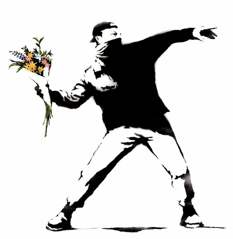
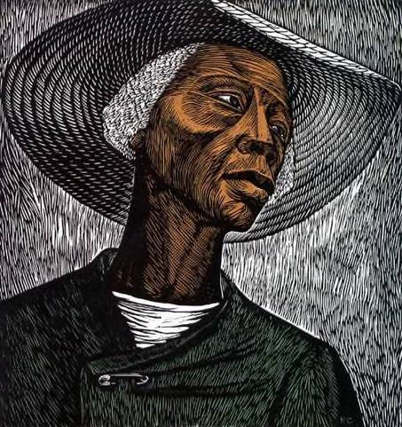
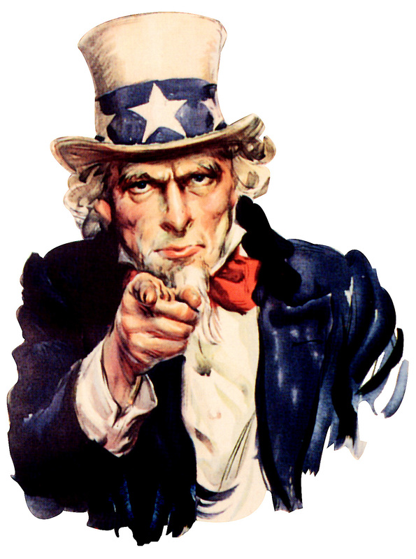
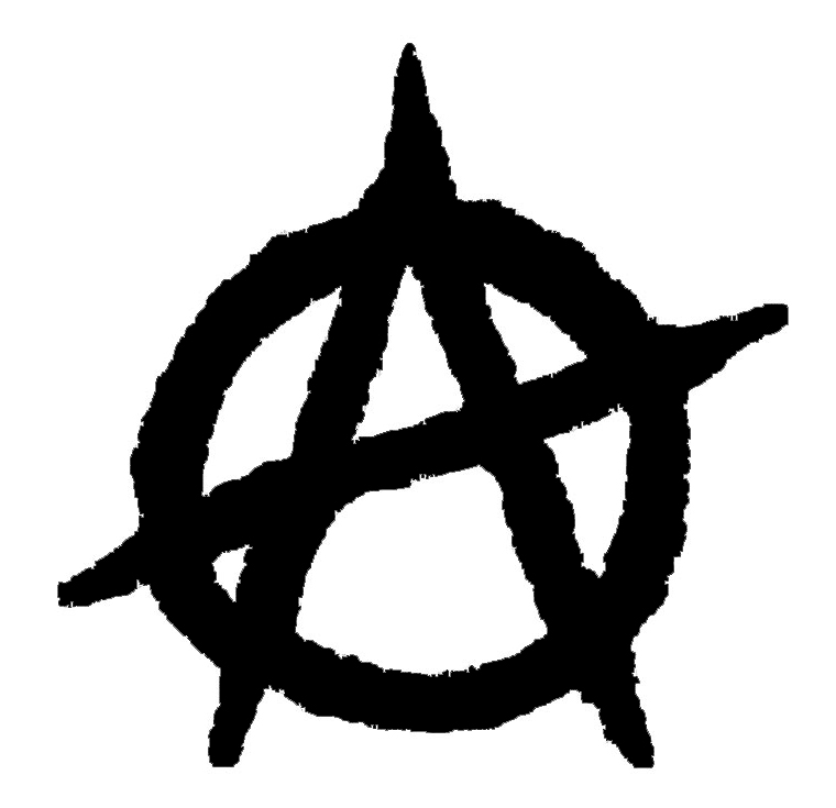
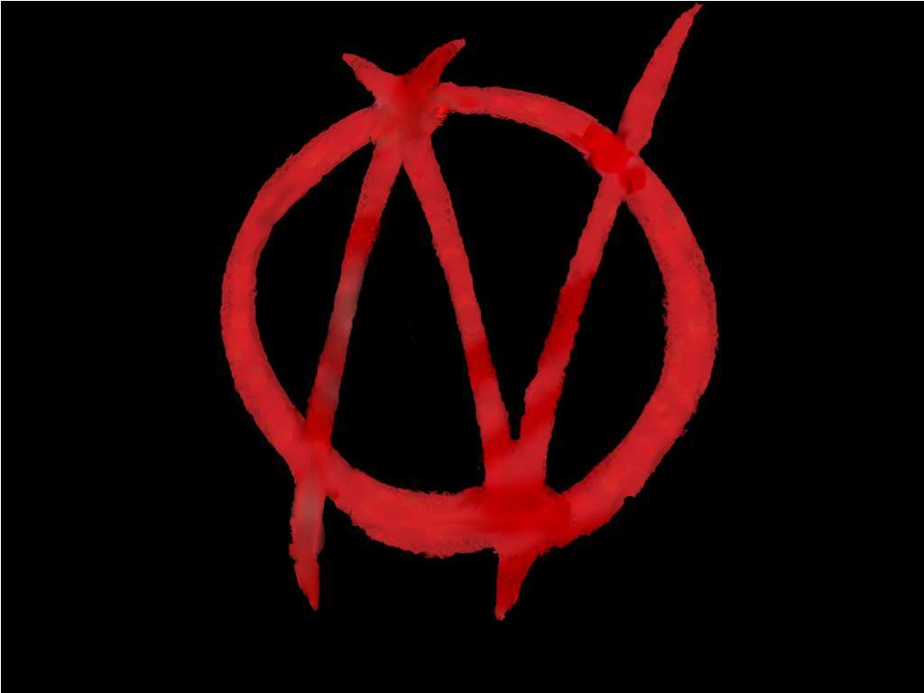
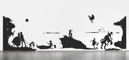
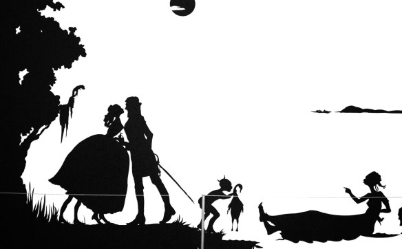
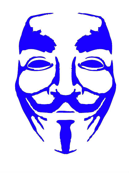
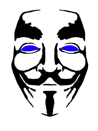
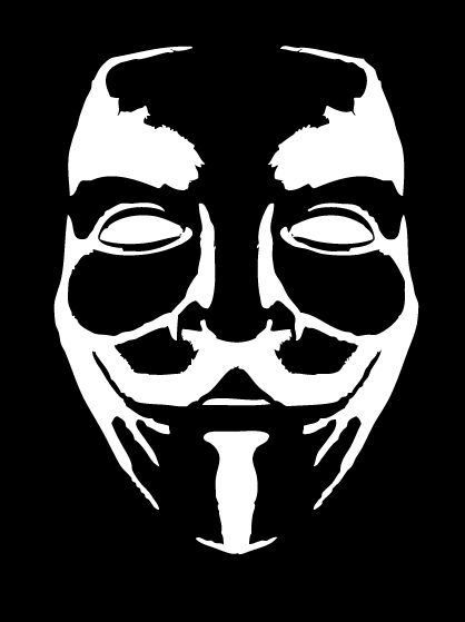
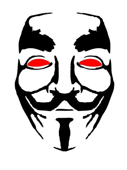
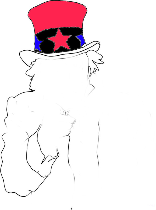
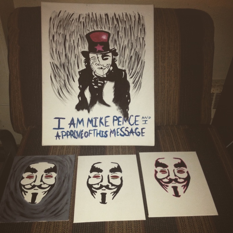
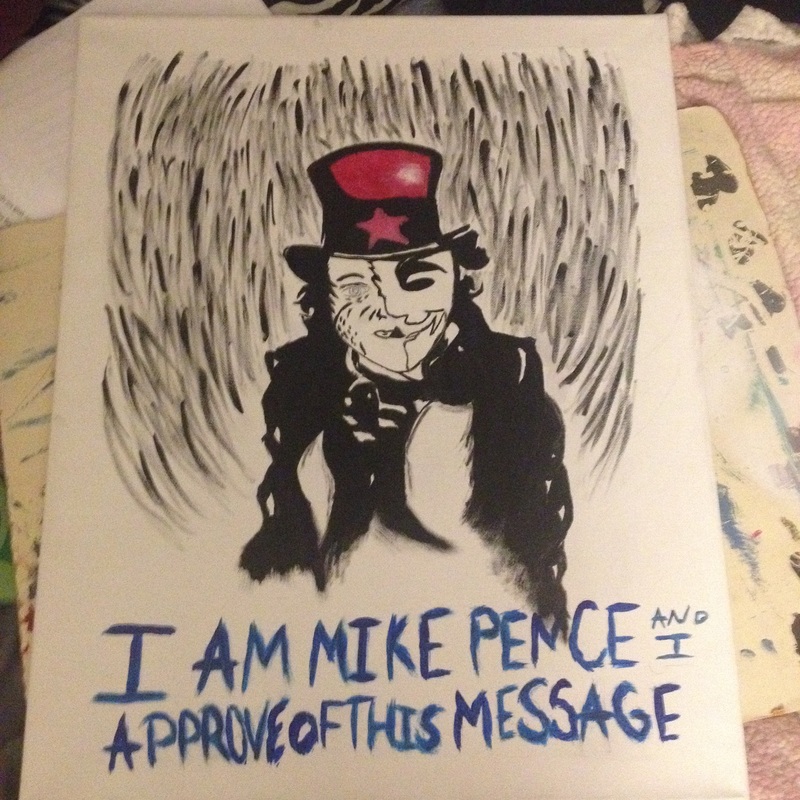
This year for winter term of 2015, I am taking Printmaking 243, a course that introduces the basic understandings of printmaking an art form and explores multiple techniques, and printmaking processes. This course includes the study of the history, and the study of a print image preservation, storage, and identification. Printmaking is all about the organizational skills which will help students complete the task at hand, on time, and learn to make technical pieces, that will influence them in their final prints. I Mailika States, am proposing a 3 block linoleum, 16 x 20, monotype (with minimal color) print called Uncle Vence. The main emphasis of the piece are the three key subjects that make it up: a Guy Fawkes Mask, Mike Pence, and the Uncle Sam hat. Each symbolize something differently, but each have a message that connects each other to create a bigger message. The Guy Fawkes mask is a symbol that is very recognizable and is a symbol that it meant to stir up a person, and have them march against their government. The mask is meant to instill fear in politicians, and anyone of a political stature, because the people aren’t suppose the fear the government; in turn the government, should fear us because the people outweigh the government. The next piece of symbolism used is Mike Pence’s face as the other half of the mask. Recently Mike Pence signed the Religious Freedom Restoration Act (RFRA), which made a lot of people angry, because originally this bill was signed in 1993, and many people found it to be an unconstitutional bill in some states. This was seen as an unconstitutional because it is not the proper exercise of Congress’s enforcement power. The bill states that it is to “ensure that interests in religious freedom are protected”, the religious “freedom” that Mike pence had signed is “aims to prevent state and local governments from "substantially burdening" a person's exercise of religion, unless the government can prove it has a "compelling interest" and uses the "least restrictive" means to do so.”[1] Many people in the state of Indiana were outraged at Mike Pence upon signing this saying things such as “they didn’t listen to us”, “it’s a sad day”, “and “this is more harmful to the state than out governor thinks”[2]. People in the state of Indiana are trying to move forward with change, and have the option to be open to everyone, that comes and goes, but with the signing of this bill and many others, this only puts the state backwards. Which leads to the symbolism of the hat from the propaganda poster. The country is supposed to be a free nation, but Mike Pence is subtly making it harder for the state to move forward, and have the freedoms other states have. The hat is to emphasize the Guy Fawkes mask, making it come apparent that the freedom of our people is held back, by Mike Pence. Hence why half of his face is the mask, and the other the Mask, because we want to be free from our politicians not held back and oppressed by fear by them. The original title of the piece was actually Uncle V but since I added Mike Pence it made more sense to mock him even more by naming the piece Uncle Vence. This was also by the help of the propaganda poster of Uncle Sam. With the use of a propaganda poster style print, I am portraying that even all politicians have a bad side, but we as a nation should come together at the sign of the Guy Fawkes mask, and march against our government to make them listen to us to help benefit the nation, rather than hinder us more. Uncle Vence was inspired by three very different \artist, which use many different styles, but have a big influence on my work as whole. This developmental process of why I chose these three artist come from a book called Steal like an Artist by Austin Kleon. In Steal like an Artist Kleon uses the universal message “You don’t need to be a genius, you just need to be yourself”[3] Creativity is everywhere old and new, it doesn’t matter where a person turns they’re being influenced daily by the things around them, even if they do not know it. For I am influenced by the constant flaws our politicians make every day by watching the news, and finding the flaws of what they say and putting them into perspective. I like to see if politicians listen to what people say, much like in Banksy’s art, which has made many people of power angry, but his works have a simple message of “pay attention” as he points out what’s wrong with governments across the world. I chose Elizabeth Catlett less because of the political message in hers about racism, and the fight for freedom of all races in our country; but rather I chose her for her mark and form, along with subject matter. The last artist I chose is Kara Walker, her art are not prints, but rather clean paper cut outs. She uses minimal detail to make the form come alive, and have a noticeably shocking image done. Each have their own style, and are influenced by many things, but seem to put emphasis on the bigger picture of our nation (or nations). The first artist I chose, and have kept with since the beginning of the class is Elizabeth Catlett, because of her detail through the use of mark and subject matter. Catlett’s work is a mixture of abstract, and post-modernist tradition, with a great cultural influence from African and Mexican art. The marks Catlett makes are what influenced me to make the background the way I did. In her pieces she uses defined bold lines that take the visual movement in many different directions to make the eye look at the detail in her work, and follow the movement of the piece. The marks are bold and very strong because they each go in different directions. For example in Sharecropper[4] the direction of each mark changes drastically as you move throughout the piece. From afar the marks look to be a unified piece, but in all actually the marks move in different directions, which help move the piece from top to bottom rather than in once spot. The most important aspect of the piece is the use of minimal color she has in many of her pieces. For example in Sharecropper she uses the color brown to color the skin to show emphasis that the sharecropper is a black person, because in old photos their black and white, but the emphasis on the color. Catlett just makes the color of the skin come alive. In my piece Uncle Vence the minimal color I use it to emphasis the red in the eyes, and the red in the hat. Red is most commonly associates with blood, but in this case can be associated with the symbol of being alert, aggression, battle, and courage. It’s a bright color used to alert the audience of what important parts of this message is being portrayed. The next artist I chose is the infamous Banksy, mostly known for his outlandish works that draw a huge audience in the art world, and draws the attention of many people in high places that aren’t very keen on his art. Banksy is an interesting printer because he uses the style of Pochoir, which is a stencil style with the smallest details cut out, when the stencil is done all he has to do is put up the stencil on a wall, and paint over it with a brush filling in all the detail made in the stencil. Banksy has influences me greatly with his style, because I don’t want the print to look like a three block linoleum cut, but rather to confuse the audience and make it look like a Pochoir style print. In many of his prints Bansky will use little to no color at all =, but rarely uses a lot of color because in his works color is to emphasize the subject at hand. Banksy’s subject are normally black and white, but with the use of minimal color he uses it to emphasize the black and white subject matter. For example in his early work Love is in the Air[5] he takes an image of a protester, who looks to be menacing, but has a major twist at the end of his arm: a bouquet of flowers. Rather than having an actual cocktail Molotov, he uses a bouquet of flower to emphasize on how much violence we use in our nation. It’s to shock the viewer, and put an in the face image in your face, and draw attention to the bigger issue at hand: violence. In my piece Uncle Vence to make the propaganda in your face I use the motto that many politicians use at the end their commercials “I [insert name] approve of this message”, which is to tell viewers to back this up, but I am mocking Mike Pence for backing up something the people didn’t even want, or even attempt to vote in. This has the bigger message and poses the question of “Do our politicians listen to us or do they just do what they want?” The last artist I have chosen, and that I enjoy very much is Kara Walker, not only is she not a printmaker, but she uses minimal detail to make the paper cut out stand out and create a bigger message just through simplicity. Kara Walker mainly focuses on the topics of race, sexuality, repression, and gender. The detail that I see are at the end of her cutouts, each is a recognizable piece individually because of how you can make it out even from a very far viewing distance. Walker also uses the detail to her advantage to create a story in a simplistic way, but also mocks many great novel while doing so. In her Gone with the Wind influenced based piece setting of the book, she called it Gone: An Historical Romance of a Civil War as It Occurred b’tween the Dusky Thighs of One Negress and Her Heart[6], she creates an elaborate story with just her cutouts. It is to depict the south during the civil war and is a small narrative that begins with the two members of the upper white class, a woman in an ornate gown and a man with a sword, which shows he holds the power, but next to them is a young (very likely African American) boy with devil horns he holds a dead duck, which is to show that in the 19th century the stereotype of a young black boy of being mischievous an devil-like. Even though this is just the first part of the cutout it continues to use subtle undertones of hidden, but bigger in your face symbolism in all around the piece itself. This has influenced my piece, because at first I had left the subject matter of my Uncle Vence piece in the middle with no correlation to what it was supposed to mean, but with the bubble message that says “I am Mike Pence and I approve this message” will draw viewers to what the message is tying together. Another key aspect to Kara walker that has influenced me greatly is the range of viewing distances she has for all of her pieces. Up close to her pieces a viewer can see the close detail of the cut out on the ends and see the recognizable form. Even if you walk far away from it a viewer can still see the shape of the form and see the recognizable shape. With my piece, I did not want the piece to look like a giant black blob but rather something a person can recognize from afar, and this is why I put minimal color it. The color can be seen from afar because of the recognizable shapes, and the colors are red, white and blue (this was actually not intention, but a happy coincidence) symbol of the American flag which is seen everywhere in our country as a symbol of patriot feel, and freedom that we are supposed to have in our country. Even though I have a lot of influences, my subject matter, the image, and the medium, I have two weeks to complete the task at hand. Since this is a relatively long time (but a short period of time), I have made an organized schedule of deadlines and dates and things to have done, by the last day. My goal is to have the image printed and hung up by Wednesday, April 8, 2015, so I may get many other options done. At any rate the schedule will go as follows: The first three days is devoted to research, finding my influences that will lead me into creating thumbnail images of each idea I have. This process also includes the Steal like and Artist assignment that includes finding artist that influence you rather than “inspiring” you because there is a big difference between what each word means. [7] With the help of research, and finding my influences the next few days I will draw up a picture, rather than have a thumbnail, I can have a bigger image of what I want, and be able to move on cutting out the linoleum. This is also responding to my influences, with response I can see where I am at in the image, and see if I am missing any little details that I want, and it shows the receptiveness of what I’m getting out of my work. I will then proceed to cut out the thin, white, rice paper, which is 16x20 but the image is 8 ½ x11 inches, which is slightly smaller than the printing paper purposefully to have negative space, and a clean border around the edges. Throughout the weekend, I will have the three pieces of linoleum finished, but if I make a mistake I will have a few copies precut, in order to deter from being off schedule from a simple mistake. Since I have the colors chosen I will cut three, separate small thumbnail sections of where the color will go to help save the linoleum, and time when it comes to printing out the color on top of it of the image. Before I begin to print I will have to look back at my influences and the drawing so that I have a reminder of where each color goes, and what each mark is before starting, because if you don’t look beforehand that’s how mistake happen. I will use a water based color ink, and a water based black ink. I will spend one day doing the color, but I have to keep in mind that the ink takes about 2 ½ hours to dry prior to printing another color on top. So I will take six hours of studio time to get the ink done in day. That means coming in the morning when the studio opens, after lunch, and then after dinner, even though I am not printing each color on top of one another, it is best to let the layers of ink dry, so they don’t bleed through or get smudged. After I will have to put the image on top of the color because this linoleum will have all of the black on it. The last layer of the piece I will have done will be the border, since these are the most important bold marks, and must be set in the parameters of the border I created. All in all if I follow the schedule I will have the piece done on time, but if things go well, I can have it done before the date I have presented. When displaying my piece since it’s a 16x20 it is quite large, but will have to center in the middle of the wall rather than to the side of the gallery walls. The piece will be hung out with clear thumbnails so it will not fall off the wall and is easily portable, when the show is over. By using thumbtacks it will not damage the canvas at hand, and can be easily taken off the walls if needed to be moved. The image will have nothing else around it. In the classroom though the image is displayed with the artist influences, and the size dimension of where the border will go, and what type of background I will use. Each idea is different, but with white it will be easier to connect the white parts of the piece to the wall, and create a sense of balance throughout the piece. While going through with my schedule I will updating my website, which is to help market in my audience in, and show them my progress throughout the creative process. My website will include my Steal like and Artist influences with an explanation as to why I chose each, and how they each individually influence me. The next thing on my website will be my response, my images, and the thumbnail sketches I came up with in the first few days. These will have what’s working, and what’s not working on each one to show the progression towards the larger image. For example in my website I have my first piece that says “This piece shows great potential in being simplistic, but is too simple in many ways. The black and white stand out in correlation to the color standing out, but it seems to be flat, and not rounded out.” With responses like these viewers will see how I went through the steps to get to the final print in the end. My website[8] is to serve the purpose of showing the audience, where I stared and ended with the project, and reach my goal by the end of it. In concurrence, with my final piece I can respond to it with my future work, and use it as reference to when I need influences to come back to. What I enjoy most about the piece is the use of the symbolism to draw attention to the imagery that I have presented. I originally had just the mask as my main focus, but I found it too simple and it didn’t work out or get the message I wanted to portray by with it. I researched deeper into the meaning of the mask, and what symbols it referenced, or I could put with it, and I found the Uncle Sam propaganda poster. Originally I was going to leave the hat out, but it helped out with balancing out the silhouette form I had created. The next thing that I needed to work out was the use of the background. Through my research I look through a lot of Elizabeth’s Catlett’s prints to see what type of background she made. They were normally very abstract or made the visual movement change the composition, or balance it out from top to bottom. I found that with a border the image will have a simple background that stopped at the shoulders of the figure, so it will not distract from the subject matter. I used short, small strokes to create the background, rather than large, bold marks because it would have distracted from the form. When I was looking at my final image without the comic-like thought bubble, the images message and mocking tone I wanted wasn’t clear. With the help of just simply reading a comic book during a break I drew it in, and the first thought that came to mind was the “I am Mike Pence and I approve this message” because it’s a line a lot of people know from a political commercial. I used the line to mock Mike Pence, for choosing to sign the bill recently. Also originally I had the mask, overlapping Mike Pence’s face, but I didn’t like how some of the lines in his face got lost, so I put it side by side, so it looked as if the mask would engulf his face. With the smallest alterations I had the mask and the face all in one. The color I had chosen was seriously a happy coincidence that it was red, white, and, blue. The white is implied because it won’t be printed, but the red and blue will be printed. The red is the eyes and the hat of the subject; while the blue is the soft undertone of the aloofness of his mistake used to help soften the strong, black figure in the middle. I chose to put minimal color in because the black and white monotype was too strong, even from the original drawings it was a little creepy from a faraway distance. Even though the viewing distance was great, I had to add color. On the original drawings I put color in, and it made the face a lot creepier than intended. So as I moved forward into the bigger piece I decided to leave in the color, and it help with making the image pop, rather than sit stagnantly on the paper, I wanted it to stand out a little more. The next to last problem I was having from the beginning was if there were to be a body or not. With the help of the propaganda poster, I chose to use that type of body style, the style of Uncle Sam[9] pointing at the viewer, rather than having a creepy floating head. The last problem I have having was with including the last symbol, which I kept out, and I am very happy I kept it out. The Anarchy/V symbol[10] is a cross between the symbol of the Anarchy and the V for vendetta signature he used to show that what he blew up was him. It is used as a signature, and I couldn’t seem to find a way to fit the signature on the bottom of it. I thought of stamping it on the paper, but the image itself is very distracting and would draw attention to it more than the image itself. The one thing that would have worked about the signature was the color would have matched the other red parts of the composition. Even though that may have been the case, it was still not working because of how distracting it was, so I concluded to take it out and leave it out. All in all I believe I reached my goals very efficiently in the time frame given. My main goal was to have a quality inked, black and white print, but I pushed beyond my ideas and created a bigger better image that portrayed my ideas a lot more clearly. I did this by going through the creative process step by step. By first researching my influences each helped with making the print better that I expected. I took my influences and responded to their mark and style and incorporated it into my own work. Without the influences the marks, and color usage wouldn’t have been fully considered. My other goal I was glad to have reached was getting done in the time frame. With an efficient planned out schedule I got the print done in time, and I had time to prepare and make adjustment, when displaying the print on the wall. My last and concluding thoughts on the piece are that I’m proud of making the effort to come up with an organized time frame that helped me succeed in finishing the project. [1] "Religious Freedom Restoration Act." Indianapolis Star. Indy Star, 13 Apr. 2015. Web. 09 Apr. 2015. <http://www.indystar.com/topic/religious-freedom-restoration-act/>. [2] "RFRA Reaction Ranges from 'sad Day' and 'harmful' to 'right Thing to do'" Indianapolis Star. Indy Star, 3 Apr. 2014. Web. 09 Apr. 2015. <http://indy.st/1bxPg65>. [3] Kleon, Austin. Steal like an Artist: 10 Things Nobody Told You about Being Creative. New York: Workman Pub., 2012. Print. [7] Influence- the capacity to have an effect on the character, development, or behavior of someone or something, or the effect itself. Inspiration (inspire) - fill (someone) with the urge or ability to do or feel something, especially to do something creative. [8] http://mailika-states.weebly.com/ |
InfluencesSketchesFinal Painting |