Challenge 4
Challenge #1
A struggle between human relationship with others
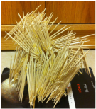
Front View
|
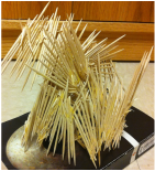
Left Side View
|
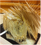
Back Side View
|
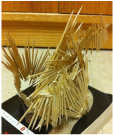
Right Back Side View
|
Right Side View
|
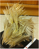
Materials: Toothpicks and glue
The objective was to make a toothpick sculpture that depicts struggle and spirit. Through the process of making this I brainstormed out ideas, made research, and document every step of the way into creating this mass of struggle and spirit.
The objective was to make a toothpick sculpture that depicts struggle and spirit. Through the process of making this I brainstormed out ideas, made research, and document every step of the way into creating this mass of struggle and spirit.
Challenge #2
"We Have More in common than We Have Differences"
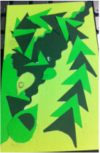
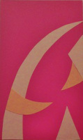
Monochromatic: Through many trials on this monochromatic piece I had finally found my major movement and somewhat of a minor movement. There is one problem: I do not have a focal point. As I continue to work through this monochromatic piece I will have to manipulate and fuse shapes together to make a focal point. The colors are also very vibrant and I need to find colors on the wheel to make them less vibrant.
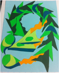
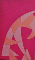
Adding Color: I went through 15 drawings to get to this point in my composition. I managed to make a major movement, and also have the minor movement with a focal point. By finding inspiration from a piece by Alexander Rodchenko, I learned to utilize the negative space around my major/minor movements. I decided to add depth to some of the shapes, by playing with different colors. The orange color is an additive color that helps with transitioning from point to point. I chose blue because on the color wheel green and blue are next to each other, and I saw that the colors are harmonious to each other, and add a calming effect to the very vibrant hues of green.
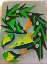
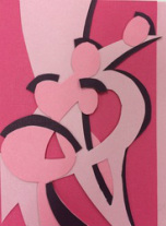
Final Composition: In my final piece I managed to make more 3D forms to some of the shapes. I also noticed I had only used the light blue as my background and decided to unify the shapes of insides of the darker green triangles. I also cut down on the orange to make a subtle minor movement/ transition from the major movement to the minor movement. I also used the minor movement of the fused shapes in the bottom right corner to help make movement between the negative space by spacing out the shapes more.
CRITIQUE on ALy Sander
|
|
|
As I look throughout the design process Aly has gone through to get to her final composition I notice the subtle changes that have been made in each composition. As a result to responding to each change she came up with a design that is shockingly different from my other peers works.
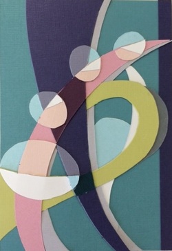
In her monochromatic piece I see the major and minor movement, but the movement is accented in the harmony of warm colors she chose. The major movement moves to a focal point made from the negative space. A tiny blue triangle is the main focal point in her composition. Also, the focal point isn't too strong for the composition and fits perfectly in with the minor movement. From the focal point the repetition of shapes create the design principles very obvious.
The minor movement is very intriguing. I noticed in the first two monochromatic pieces that the minor movement was created through the contrast of the shapes. In the final composition, the focal point helps point towards the minor movement. the second minor movement is created through the color contrast of the green which points back to the focal point. Even though one movement goes away from the focal point, one movement points you back to the focal point through these minor movements. The movements help build upon the negative space through visually weighing down on the major movement. To keep the major movement from being dominant the contrast of the colors help keep the composition in balance. The minor movement also keeps the focal point contained inside of the movement around it.
As I looked back at her monochromatic piece I wasn't expecting the color choices to work in harmony. The cool colors create a very nice temperature and keep the rest of the colors on harmony. By utilizing the negative space and with color contrast the colors create a visual pause at each color because with each different color your eye moves in the direction of which each color points too. With the color choices I can see the clockwise movement and the major/minor movements throughout.
The WOW factor in this design is how the colors make me visually pause. When I first saw the shapes made up of different colors I visually paused and saw in the negative space many different shapes.
Finding Color
Found object digital color wheel photograph
First Stages
Second Stage
Final composition